 |
| Christina + Renan |
Last Saturday was the big day! Months of prep and I was feeling the pressure... What did I have to show for it??!
Sorry folks, I was hoping to have a lot more pictures but I was so stressed and busy that I didn't have time to stop and take pictures! I hate it when that happens.. I saw the photographer take some pictures so I asked my friend for copies when she got her pictures. I was expecting to wait months for them but the photographer is amazing and just posted a few pictures on her blog!
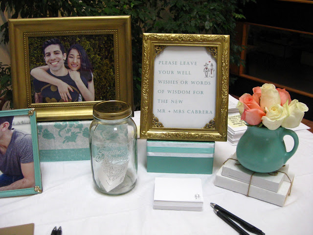
One of the few pictures I did manage to take was the guestbook table at the church:
 |
| Life Designed |
The best compliment I got was when one of the co-maid of honours said, "This is SO Christina!". Phew! What a relief!
Here are some close up shots from the photographer:
 |
| Guest Book Table |
 |
| Guest Book Table |
 |
| Guest Book Table |
Oh, see that flowery box on the left? That's actually a napkin I found that I used to cover an old shoebox! It was the perfect colour and style for the wedding that I had to find a way to use it!
 |
| Snack Bar |
The vintage looking labels I used can be found here. I just changed the colours in photoshop to fit the wedding colour scheme!
 |
| Snack Bar Signage |
Because it is!
I just added a coat of Martha Stewart's gilding paint in brass and I think it looks lovely!
Okay, now on to the centerpieces:
For months I scoured thrift stores for vases and by the time of the wedding, I had about 200 vases, most of which I either painted or covered in lace.
 |
| Life Designed |
For the circular base, I ordered 14" cardboard cake circles from Wilton and painted them seafoam. I took the above picture with my little point and shoot. If it looks a little lack lustre, it is!
 |
| Cake Table + Centerpiece |
Christina said it best, "The flowers were such a small but pivotal touch". I agree. And I love the pink, cream, seafoam and gold colour scheme. I initially wanted peonies but the roses are classic and lovely!
Isn't the cake so cute?? And those custom made cake toppers from Etsy are awesome!
 |
| Head Table |
A close up of the head table. Yes, that's a baby jar! Good thing I have a niece and nephew- who happens to eat like a beast! I gathered at least a couple dozen from my sisters! It's a great, economical and sustainable way to decorate!
To save money, I even used plastic cups for some of the lace candle holders! No one knew the difference until they actually touched them! I just had to make sure we used battery LED candles and not real ones! Melting plastic would not have been good... =)
I also used Starbucks Frappucino bottles, other juice bottles and lotion bottles! Whatever I could find, I used!
 |
| Head Table |
I was happy when the lights went down because the head table glowed and it was so pretty!
 |
| Head Table |
 |
| Head Table |
 |
| Head Table |
You can really tell the difference between my point and shoot pictures and the professional shots! I took this one right before I got the flowers. I was so happy to get pink and cream flowers. It was a nice surprise because I was told we were only getting cream. The pink was definitely needed to add more colour and dimension! (Sorry, I don't have a full shot of the final head table!)
Sigh... my biggest disappointment is that backdrop.
When the rental company came to set it up, my heart fell. It wasn't what I was expecting. There was no way I was going to be able to hang all the frames that I had laid out.
I ended up being able to use only half of the frames. I'm not going to lie...I wanted to cry. It looks so sparse to me...
Everyone was really encouraging and told me it looked fine but it's so disappointing when you spend so much time and effort on something and it doesn't turn out exactly how you envisioned it.
Christina and Renan were so gracious and lovely! They thanked me several times throughout the night and afterwards as well.
This was the first wedding I have decorated to this extent. Everyone asked me if I would do it again. Yes and no... haha. There were definitely stressful moments...but overall, it was such an honour to be a part of their day.
So there you have it, a romantic, vintage inspired wedding!

You did a great work there Nancy! I love everything that I've seen so far!
ReplyDeleteWhat a beautiful couple :)
Maria
They sure are! Thanks Maria! You're always so sweet!
DeleteNancy
Agree with pink, seafoam, and gold colour scheme they just complement each other so well! I'll be showing this to my friend who's getting married next year in April. She's been collecting picture frames and glass bottles and laces to use for her wedding, this should give her ideas!
ReplyDeletesupreme clothing
ReplyDeletelebron shoes
supreme hoodie
curry 7
kobe basketball shoes
kyrie irving shoes
supreme hoodie
cheap jordans
stone island t shirt
air jordan
directement depuis la source sacs de répliques en Chine allez sur mon site Valentino Dolabuy Bonus Dolabuy Gucci
ReplyDeletea1v44j2k81 i9v36o3d30 n8r88s1s56 f3w29o6e69 d2a99q5s69 p9l72v3i87
ReplyDeleted6c61j7l34 v7n36p7y73 http://www.dolabuy.ru/belt-bag-c-157_168_175/gucci-high-quality-gg-marmont-matelass%C3%A9-leather-belt-476434-bag-p-1137.html>r6h55d6c15 a4i96u2n41 h3x98e6z46 e5l15j6z67
ReplyDelete