Thursday, June 21, 2012

Wedding Reveal!

Christina + Renan
Introducing the beautiful bride and groom! Now that is one good looking couple. Beautiful inside and out.

Last Saturday was the big day! Months of prep and I was feeling the pressure... What did I have to show for it??!

Sorry folks, I was hoping to have a lot more pictures but I was so stressed and busy that I didn't have time to stop and take pictures! I hate it when that happens.. I saw the photographer take some pictures so I asked my friend for copies when she got her pictures. I was expecting to wait months for them but the photographer is amazing and just posted a few pictures on her blog!

One of the few pictures I did manage to take was the guestbook table at the church: 

Life Designed
Instead of a conventional card box, we used the birdcage to collect all the cards. The black and white photos are of the bride and groom's parents on their wedding day. The bride- Christina, really wanted to incorporate this bit of history on her day which I think is so sweet.

The best compliment I got was when one of the co-maid of honours said, "This is SO Christina!". Phew! What a relief!

Here are some close up shots from the photographer:

Guest Book Table


Guest Book Table
Guest Book Table
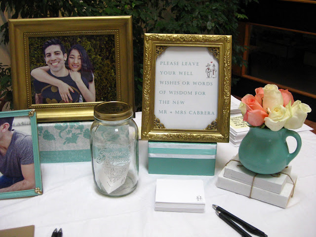
Most guests don't get a chance to write a meaningful comment in the guest book. Usually they just enter their name, maybe their address and a little "congrats" note. So Christina wanted a "well wishes" jar where people got to write a longer blessing. They're going to use the filled jar as decor in their new home and every day they can read a new blessing! So cute!

Oh, see that flowery box on the left? That's actually a napkin I found that I used to cover an old shoebox! It was the perfect colour and style for the wedding that I had to find a way to use it!

Snack Bar
I love candy bars! The bride bought a bunch of their favourite goodies for guests to enjoy and take home as favours. I was going to purchase acrylic stands but due to budget, I ended up buying gift boxes at the dollar store and painted them seafoam. I love the touch of colour!

The vintage looking labels I used can be found here. I just changed the colours in photoshop to fit the wedding colour scheme!

Snack Bar Signage
Does that look like a dollar store frame?

Because it is! 

I just added a coat of Martha Stewart's gilding paint in brass and I think it looks lovely!

Okay, now on to the centerpieces:

For months I scoured thrift stores for vases and by the time of the wedding, I had about 200 vases, most of which I either painted or covered in lace.

Life Designed
For the circular base, I ordered 14" cardboard cake circles from Wilton and painted them seafoam. I took the above picture with my little point and shoot. If it looks a little lack lustre, it is! 

Cake Table + Centerpiece
Christina said it best, "The flowers were such a small but pivotal touch". I agree. And I love the pink, cream, seafoam and gold colour scheme. I initially wanted peonies but the roses are classic and lovely!

Isn't the cake so cute?? And those custom made cake toppers from Etsy are awesome! 

Head Table
A close up of the head table. Yes, that's a baby jar! Good thing I have a niece and nephew- who happens to eat like a beast! I gathered at least a couple dozen from my sisters! It's a great, economical and sustainable way to decorate! 

To save money, I even used plastic cups for some of the lace candle holders! No one knew the difference until they actually touched them! I just had to make sure we used battery LED candles and not real ones! Melting plastic would not have been good... =)

I also used Starbucks Frappucino bottles, other juice bottles and lotion bottles! Whatever I could find, I used!

Head Table
I was happy when the lights went down because the head table glowed and it was so pretty!

Head Table
Head Table

Head Table
You can really tell the difference between my point and shoot pictures and the professional shots! I took this one right before I got the flowers. I was so happy to get pink and cream flowers. It was a nice surprise because I was told we were only getting cream. The pink was definitely needed to add more colour and dimension! (Sorry, I don't have a full shot of the final head table!)

Sigh... my biggest disappointment is that backdrop. 

When the rental company came to set it up, my heart fell. It wasn't what I was expecting. There was no way I was going to be able to hang all the frames that I had laid out. 

I ended up being able to use only half of the frames. I'm not going to lie...I wanted to cry. It looks so sparse to me...

Everyone was really encouraging and told me it looked fine but it's so disappointing when you spend so much time and effort on something and it doesn't turn out exactly how you envisioned it. 

Christina and Renan were so gracious and lovely! They thanked me several times throughout the night and afterwards as well. 

This was the first wedding I have decorated to this extent. Everyone asked me if I would do it again. Yes and no... haha. There were definitely stressful moments...but overall, it was such an honour to be a part of their day. 

So there you have it, a romantic, vintage inspired wedding! 

Saturday, June 16, 2012

Head Table Place Cards

To jazz up the head table, my friend requested place cards for her bridal party.

We could have done simple tent cards but I wanted to do something a bit more fancy and I had these little frames I got from Michaels in their $1.50 bin.

Life Designed
They were just sitting around waiting for me to do something with them. There was actually a third one which was square but I accidentally stepped on it one day and it broke... =(

I got these several months ago and when I went back to Michaels, they didn't have these frames anymore but they did have these plastic ones:

Life Designed
I definitely prefer the first ones I bought but these will do!


The bride and groom's frames got painted gold while the rest of the bridal party got seafoam. Sigh... I just love seafoam!

Life Designed
Much better than tent cards don't you agree? AND it totally fits with the "frames" theme.

Hope ya'll are feeling the love this past week with all the wedding related posts!

Warning: most of next week will be wedding reveal week! =)

Friday, June 15, 2012

DIY Wedding Seating Chart

Wedding seating chart.... what to do?

There are lots of ways to do this. From something really rustic and cool:


I LOVE this! So great for an outdoor wedding!!


Also great for an outdoor wedding! So rustic- I love it!


There are many options and sometimes you're limited with how many tables you have to work with. My friend's wedding has 24 tables! That's a heck of a lot! 

So...can you guess what I made??

Surprise surprise! It's a frame!

I went to Michael's and found these wooden paintable frames that you can customize to whatever size you want.

I got two 28" and two 26" pieces. I don't have a picture of them, but I found a similar one from Sew Much Ado:

Sew Much Ado
These bars lock together (I recommend a mallet) with a tongue and groove joint:

Sew Much Ado
So I originally envisioned this seating chart to be double sided and hanging from the ceiling with clear fishing wire but the venue didn't have a T Bar ceiling and I don't think they would appreciate me poking holes in the ceiling.
Luckily the venue has rentable easels in gold so that was an easy compromise!

I kept going back and forth with different colour combinations: a gold frame, white frame? Seafoam! Gold ribbon? White! Seafoam cardstock? Gold? White? White AND gold!

With the combo finally settled, I bought 1" white satin ribbon and created these stripes:

Life Designed
I pulled the ribbon taut and staple gunned them to the back of the frame:

Life Designed


This project took a bit of measuring and calculating to get the right proportions and positioning and... math is not my forte but I finally got it! =)

I couldn't find gold cardstock that didn't cost an arm and a leg so I just painted the cardstock gold and then printed the names in seafoam on white cardstock. 

Life Designed
And with some double sided tape, the mock up for the bride's approval was complete!

Life Designed
Thankfully the bride approved and here's the final product:
Life Designed

There was a last minute change and 24 tables became 23... so I added their caricatures that her mother in law drew on the bottom right.

I'm finding it super useful to have these caricatures or a logo or something that can be used throughout the decor. Even just using the couple's initials would be fine.

For an added touch, I used the left over felt letters from this past project and put the love birds names on the top of the frame. I had to improvise with the "and" and use an sideways "X". It works right?

I was going to use glue dots to attach the cards to the ribbon but those things are REALLY sticky which is normally a great thing but I needed something less permanent to be able to adjust the cards as I went along (and in case any last minute changes need to be changed).

So I used 3M's double sided Scrapbooking Tape which I love! It's archival, easy to use and unlike the regular 3M double sided tape, it has a film that you remove as you go along so the tape doesn't get contaminated with dust, dirt, etc. 

And when inevitably changes had to be made with the seating arrangements I was even able to peel off the white cardstock from the gold paper without any repercussions.

Life Designed
Transportation's going to be tricky but I'm going to sandwich it between large pieces of foam core and it should hold up just fine.

Pray for no rain in Vancouver/Richmond tomorrow!

Thursday, June 14, 2012

Here Comes The Bride Sign

Here Comes The Bride signs are a cute trend this year for weddings!

Take a look at these cutie pies walking down the aisle:


 I give the sign a 4 but that kid gets a 10!!!


There are so many ways to do it and I realize it's not so much the sign that makes it or breaks it- it's the kids!! And no matter what, they always make it look adorable!

Or you can forget "here comes the bride" and convey a different sort of message:


Ha ha

For the wedding we decided to continue with the frames theme so I got 4 pretty frames from the dollar store (4 x 6) and painted them with Martha Stewart's liquid gilding paint.


I used brass instead of gold because I found the gold to be too orange- I wanted more yellow.

I removed the glass and all the hardware on the back to make it as light as possible.

Life Designed
I weaved the ribbon inside the frames and adhered them to the cardstock with double sided tape.  And... here it is!

Life Designed
I really like how it looks- fresh, simple, vintage, romantic!

What do you think of this "Here Comes The Bride" trend?

Wednesday, June 13, 2012

Señor + Señora DIY Frames

I've spent months preparing my friend's wedding decorations and it all comes to fruition this Saturday!

These are the custom made cake toppers she got from Etsy. SO adorable don't you think?
As you might be able to tell, the bride is Korean and her groom is Mexican.

Custom Cake Toppers from Etsy
In addition to this, her mother-in-law drew caricatures of the beautiful bride and groom which they used on their wedding invites:


I also used these caricatures for their "well wishes jar" which I'll post later this week!

For the head table back drop, we're going to have a bunch of hanging empty frames which I've painted in seafoam and gold. Remember these frames I got at the thrift store months ago from my post "What To Do With Thrift Store Frames"?

Life Designed
Well, times that by 3 and that's what I've got!

Behind the bride and groom's seat I created these Señor & Señora frames:

Life Designed
I took two frames roughly the same size (about 15" x 12") and painted them a burnished/patina gold using the same method I used here.

One frame came with glass, the other didn't but I opted for no glass because I want these to be as light as possible as they will be hanging from fishing wire- not to mention glare from flash would not be good.

I found the lace pattern from good ol' Martha Stewart, dropped it into Photoshop cropped it and got the desired colour.

Life Designed
Here's the back of the frame. Lovely huh?

I cut the paper to fit into the groove but since there was no glass to support it, it was really flimsy. Foam core to the rescue!

Life Designed
Just a little bit of double sided tape and I was good to go!

Life Designed
A perfect fit! I got giddy and started locking that foam core in place until I realized I need to loop fishing wire through the frame first.  I'll have to wait until I get to the venue to cut the wire to the desired length and then I'll either use packing tape to lock the foamcore in place or my staple gun.

I couldn't justify buying an $18 zinc letter from Anthropologie so I was happy to find a wooden ampersand from Etsy and painted it sea foam.

For those of you wondering the colour is a fabulous find from Home Depot. Even before settling on the colour for the wedding, I came across a whole gallon of sea foam paint in the returned department at Home Depot. At the time I didn't really need it but at $9 for such a beautiful colour, how could I resist?? It was a custom blend but it's a perfect match to Martha Stewart's Araucana Teal paint.

It's all coming together in my mind... Here's to hoping everything looks as good in real life as it does in my head!


Tuesday, June 12, 2012

What To Do When A Kid Says He Wants The Ocean


(I forgot to post this back in March! Oh well, better late than never!)

After I did the decorations (here and here) for one of my nephew's birthday, I asked his older brother what theme he wanted for his upcoming birthday. I was expecting a Cars theme or Kung Fu Panda... He said, "I want the ocean!!!" Oh crap.

Then he added that he also wanted Kung Fu Panda + Transformers. Double crap. Not to mention his birthday was in March - the busiest time for me at school. Triple crap?
So I said I'd do my best but explained I have school. His response? "That's okay. You don't have to paint the walls" Haha thanks kid.

So... ocean time... What I wanted to do was hang a bunch of fish from the ceiling and create a sort of underwater atmosphere. So off I was on a hunt for fish! I thought about making some out of felt, or printing some on cardstock - both great ideas (especially the felt!) but very labour intensive! 


I searched online for fish balloons and came across these awesome fish for a really great price.

Life Designed
They are 24" long and we got 24 of them. (PS if anyone is in need of fish balloons, please drop me an email! I've heard they make great toys for the pool! One customer also used them for centerpieces)


I don't know why but I was expecting thin, flimsy balloons but these guys are actually a thick plastic beach ball material and boy...I would have passed out trying to blow up all 24 but my brother in law came to the rescue and used the electric air mattress pump to do the job.


AND the best part! They come with a pre made hole making them a breeze to hang! 

Life Designed
I also attempted to make "clam" cookies. But.... they didn't quite turn out how I wanted:

Life Designed
Oh well, I gave it a try! Can you see the icing oozing out of the "clam" in the background?? Haha...

Last minute change: regular sugar cookies! Thankfully my sister had sprinkles in her cupboard! 

Life Designed
To throw in a bit of Kung Fu Panda, I printed out a large Po along with dumplings and we played pin the dumpling in Po's mouth. The kids loved it!

Life Designed
And then there were the angry birds. I posted how I made these with pop cans here.

Life Designed
My dear friend and fellow blogger May from Charmed by Sweets made a transformers cake  which was amazing!! She is a master of fabulous fondant figurines!

Life Designed
And there you have it... an ocean/Kung Fu Panda/Transformers/Angry Birds party.


I did the best I could given my schedule and resources....Kiddo- I promise in 2 years time, I'll decorate the most fabulous party ever!